Can you create an interactive sales report with an accompanying chart without using pivot tables? Beware — this challenge is trickier than it seems!
Everything you need to participate in the challenge can be found on this page. To take part:
- First, watch the challenge video and read the instructions below the video.
- Review the previously published video(s) and article(s) on which the challenge is based.
- Download the Excel worksheet you will use to complete the challenge tasks.
- Put yourself to the test!
Take the challenge
Download the file to get started!
Want to chat about your approach and process with other Excel-heads? Join our Slack channel to share your insights and questions with like-minded learners.
The challenge 🤺
The scenario 🖼️
Here's the scenario:
We have two datasets from a small restaurant:
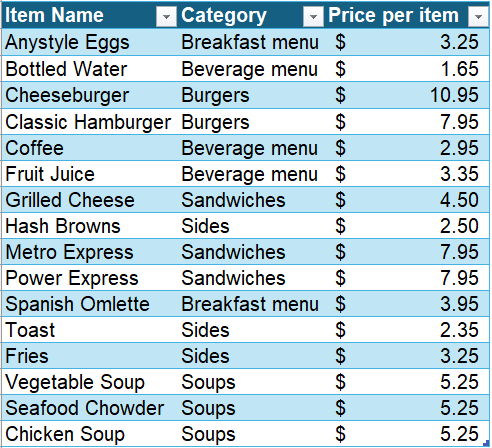
Dataset 1 contains the prices of several menu items which fall into one of the following categories:
- Breakfast menu
- Beverage menu
- Burgers
- Sides
- Sandwiches
- Soups
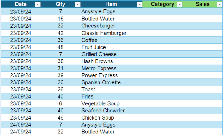
 Dataset 2 contains the daily sales of each item for five days in September.

✅ Task 1
Fill in the Category and Sales columns based on the quantity and price per unit provided.
✅ Task 2
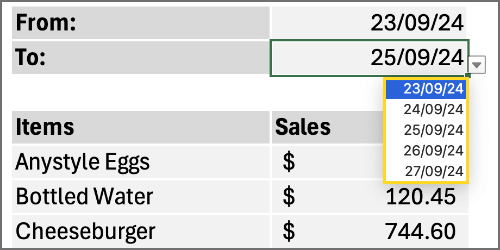
Create a drop-down list with the dates from the table. This will allow users to select a range easily, and when they do, the Total Sales per item should update automatically.
 ✅ Task 3
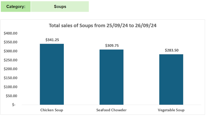
Create a dynamic chart with the following features:
- The sales data should be displayed in descending order.
- The chart title should change as different categories and date ranges are selected.
- The chart should adjust its size, expanding or shrinking based on the selected category, with no empty spaces.
- Add an “All” option in your category list so that users can see the total sales of all items within a selected date range.

How would you tackle this challenge? Get creative, but remember, no PivotTables—just formulas to keep everything dynamic!
Take the challenge
Download the file to get started!
Some clues 🔎
You'll probably need some dynamic array functions to help you along. And how about a free lesson from our new Excel Charts course?
Now it's your turn! We hope you'll enjoy taking part in this challenge; have fun!
Share your solution in our GoSkills Learners Community. Subscribe to our YouTube channel to get our solution next week. See you then!
The solution
Did you manage to tackle all the tasks? Check out our solution and see how it stacks up against yours. Have a different method? We'd love to hear it—there’s always more than one way to solve an Excel challenge!
If you liked this challenge and want to sharpen your skills even more, take a look at our Basic and Advanced Excel courses. Plus, we’ve got plenty of other Excel challenges and a resource hub packed with tutorials, tips, and tricks to boost your expertise.
Until next time, happy Excel-ing! 👋
