
By using Excel to generate charts, businesses improve their ability to cut through the noise, zero in on crucial data points, and drive stakeholders into action with compelling visual narratives.
The trouble is, making charts from scratch can be challenging, especially for beginners and time-pressed small businesses. Unless you’re well-versed in Excel and familiar with various chart types and the data sets they are appropriate for, you’ll likely spend hours fiddling with different chart elements and still end up short of the action-inducing graphic that you had in mind.
Good thing you can use Excel chart templates instead. Given the decades-old dominance and ubiquity of Microsoft’s beloved spreadsheet software, an expanding universe of chart templates for virtually every purpose is just a keystroke away. You already have a lot on your plate, so it’s best to use templates for now. In addition to the ones listed here, you can find thousands of general-use Excel templates on the Web that can make your life easier.
The real challenge lies in choosing which templates would be useful for your business. This article does much of the heavy lifting by carefully building a shortlist of practical Excel chart templates that would most likely make sense for your business - whether large or small.
Why charts are important
Data has become the most valuable commodity for any business — startup or otherwise. It provides your connection to the real world and enables you to speak the language of your market. Instead of grabbing numbers out of thin air and making arbitrary assumptions about business trends or customer behavior, data holds the kernel of truth you need to see the real picture.
Charts are a step up from tables because they use shapes and colors to focus on patterns that tell a story.
But raw data can be overwhelming, to say the least. Raw numbers and fragmented information won’t say much unless they are processed and organized to convey a message that makes sense. The standard way of organizing data is to arrange them into tables where categories, values, and variables are properly organized. That’s the reason why the familiar rows and columns of a spreadsheet like Excel have become indispensable in fields such as business, science, and research where pretty much everything depends on data.
Charts represent a quantum leap from tables. While tables enable the rudimentary understanding of a data set, charts can play tables like a virtuoso, able to use an ensemble of shapes and colors to focus the spotlight on a specific aspect of your business, uncover hidden patterns in the market, and predict how the landscape will evolve in the future.
Advantages of using Excel to create and manage charts
Microsoft Excel is arguably the most powerful and versatile tool for creating charts. Here’s why:
- Robust functions for data visualization and storytelling. Excel can generate a wide range of graphs, charts, and other visuals that make it easier to 1) spot patterns, trends, and anomalies; 2) derive valuable insights; 3) focus on a specific area or relationship in a data set; and, 4) communicate a clear and compelling story.
- Customization and flexibility. You can customize Excel charts extensively using various elements such as colors, fonts, shapes, labels, chart types, and graphics.
- Interactivity. You can create interactive Excel charts using features like slicers and pivot tables. This allows users to dynamically explore a data set, filtering noise and diving deep into details without losing the overall context.
- Data integration. Excel charts seamlessly integrate with Excel’s data analysis tools and other Microsoft software like Power BI. You can use formulas, pivot tables, and other resources to crunch, manipulate, and leverage data.
- Accessibility. Virtually every workplace uses Microsoft Office, making Excel one of the most widely used and accessible software in the world. This makes it easier to share charts and collaborate with colleagues and stakeholders.
- Efficiency and ease of use. Creating simple charts in Excel does not require a degree in rocket science. Beginners can quickly learn how to generate simple graphs using just a table of values.
16 Excel chart templates for specific business functions
Your business juggles a lot of stuff at any given moment. Any tool that takes on a share of the load would be a welcome improvement. Charts make it easier to analyze and understand data, providing a concise and clear way to present information or lend urgency to a message. Here are some areas where charts support your business.
Download all 16 free templates
Get these curated chart templates, perfect for business use!
Decision-making chart templates
Small businesses often operate with limited resources and need to make informed decisions quickly. Excel charts help visualize data, making it easier to identify trends, spot patterns, and formulate insights that drive strategic decisions.
Financial tracking chart templates
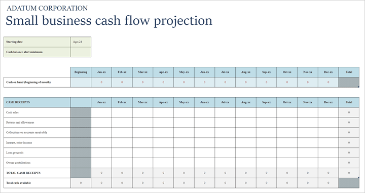
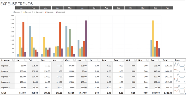
Excel charts can help track expenses, revenues, and cash flow, providing a clear picture of your company's financial health. This helps in budgeting, forecasting, and identifying areas for cost savings.
Performance monitoring chart templates
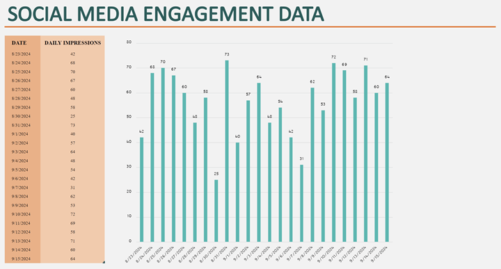
Companies need to monitor key performance indicators (KPIs) to measure progress and success. Excel charts can display KPIs such as sales growth, social media engagement, and website traffic, enabling teams to stay on track with their goals.


Investor presentations chart templates
Excel charts can effectively communicate business performance, market potential, and financial projections, making a startup's case more persuasive.
Project management chart templates
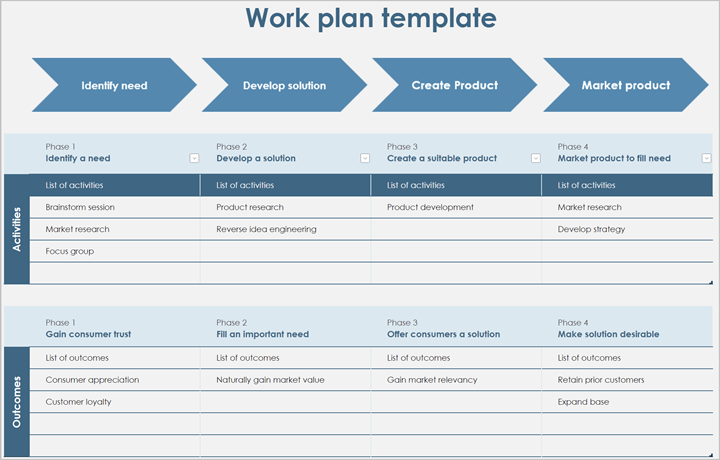
You can use charts to manage projects by tracking timelines, milestones, and resource allocation. Gantt charts, for example, are useful for visualizing project schedules and ensuring timely completion.
Market analysis chart template
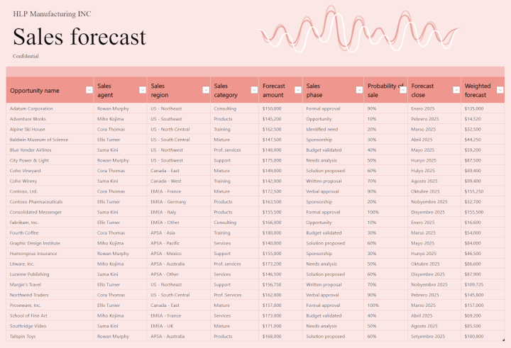
Charts can help your team zero in on market trends, competitor performance, and customer demographics, providing valuable market analysis and insights.
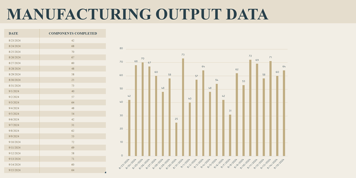
Process optimization chart template
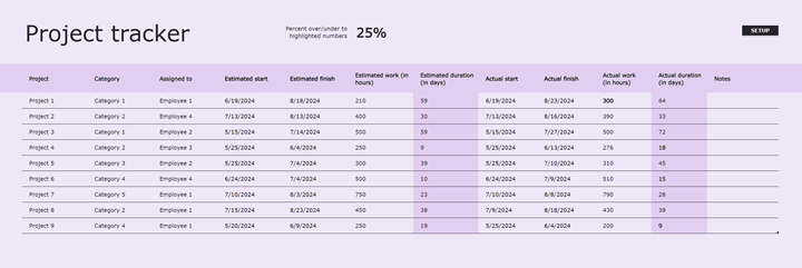
Businesses can use Excel charts to streamline operations by visualizing workflow processes, identifying bottlenecks, and tracking productivity. This helps improve the efficiency of your business.
Communication and reporting chart template
Excel charts help make reports and corporate messaging more effective at presenting crucial information to team members, departments, partners, customers, and other stakeholders.
Download all 16 free templates
Get these curated chart templates, perfect for business use!
Takeaway
Excel charts help transform data into a powerful tool that lets you discover crucial details about your business, understand the mood swings of your market, and take decisive action that puts you ahead in the field.
Not all charts are the same though. It’s easy enough to create a simple pie, column, or area chart. But your business competes in a space where impact is paramount. Trying to impress stakeholders with drab graphics won’t achieve the goals you aim for.
Sooner or later, you’ll want to build your own compelling charts and data visualizations in Excel. Get started on that with our Excel Charts for Data Visualization course by Microsoft MVP Deb Ashby.