PowerPoint. For many, the name alone is enough to inspire visions of dull presentations filled with text in generic fonts, cheesy clip art, and the occasional swooping animation for an extra dose of creativity. Groundbreaking stuff, right?
But, if you think all PowerPoint presentations are destined to look dated and dry, think again. With some recent additions available for Microsoft 365 subscribers who have PowerPoint 2016 or beyond, it’s far easier than ever to make your presentations look sleek.
“Many of the negative connotations surrounding PowerPoint are less about the tool and more about what its use most commonly represents in business settings: One person reading from a prepared script while audience members sit around reading along as if their presence is simply a check-the-box requirement,” explains Luke Goetting, Director at Puffingston, an award-winning presentation agency based in Austin.
So, if that “whoosh” sound effect isn’t going to cut it when it comes to impressing your audience, what will? Goetting gave us the lowdown on all of those new, need-to-know PowerPoint features that will turn your presentation up a few notches.
Step up your PowerPoint game
Download our print-ready shortcut cheatsheet for PowerPoint.
1. Zoom

Note: This feature is only available to Microsoft 365 subscribers and PowerPoint 2019 users.
If you think of a standard PowerPoint presentation, you likely think of something that moves pretty linearly. You start with one slide, and then you click to the next, and then the next, and so on and so forth. Sure, the slides are in a row—but, it’s easy to lose sight of how all of that information fits together.
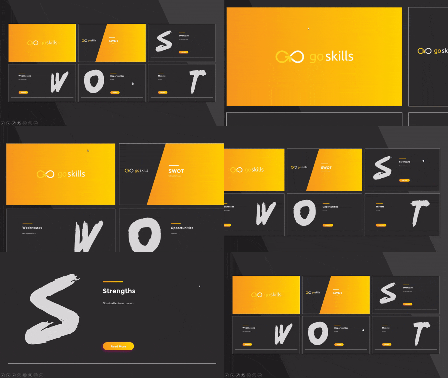
This is where the new Zoom feature comes into play. Goetting says that you can think of Zoom as a visual table of contents. You can choose which slides you’d like featured, and then the tool will automatically generate one slide that serves as a menu of all of your other slides.
Think of Zoom as a visual table of contents.
While on that menu slide, the presenter can then choose to zoom in (now you get where the name comes from!) on different portions of the presentation and jump to that section.

Not only does it look really cool (if you’ve ever seen a Prezi, you’ll see that the Zoom feature resembles that!), but it empowers presenters to better show the overall theme and context of the slideshow—rather than clicking through slide after slide and losing the big picture. Using Zoom, audience members are always brought back to the common thread.
How to use Zoom
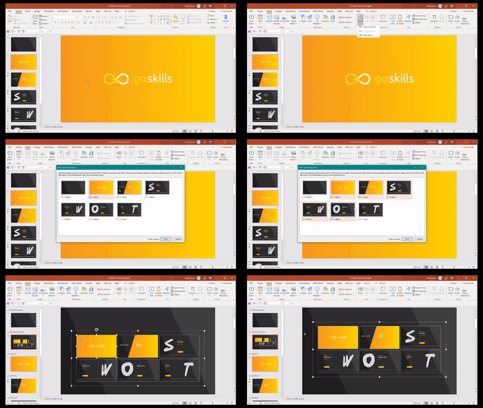
Hit “Insert” and then “Zoom” and choose from three different options:
- Summary Zoom,
- Section Zoom, or
- Slide Zoom.
Both the Summary and Section options create the menu-type slides that allow presenters to choose what they want to click on.
Slide Zoom allows you to place a clickable thumbnail within an existing slide—rather than on a menu slide.
2. Morph
Note: This feature is only available to Microsoft 365 subscribers and PowerPoint 2019 users.
Want cool transitions between your slides that don’t involve dissolving photos or roadrunner sound effects? Morph is just what you’re looking for.
“Ultimately, Morph is a new type of slide transition that recognizes how the assets on the slides have changed from the first slide to the next and automatically manipulates them accordingly,” says Goetting in a blog post about PowerPoint features.
For example, Goetting says to imagine that you had a small circle on your first slide. On the next slide, you make that circle larger. Using Morph, PowerPoint will recognize the circle as the same asset and will automatically increase the size during the transition—making the whole thing smooth and seamless.
“When used effectively, Morph allows the presenter to create an impression of a continuous visual thread—like watching a video or a Prezi—instead of a series of independent slides,” adds Goetting.
How to setup a Morph transition
For the best results, create two slides with at least one common object.
The easiest way to do this is to duplicate the slide and then move the common object somewhere else on the second slide. You can also copy and paste the common object from the first slide and paste it in the second one.
After that, visit the “Transitions” tab and click the “Morph” button to apply that particular transition.
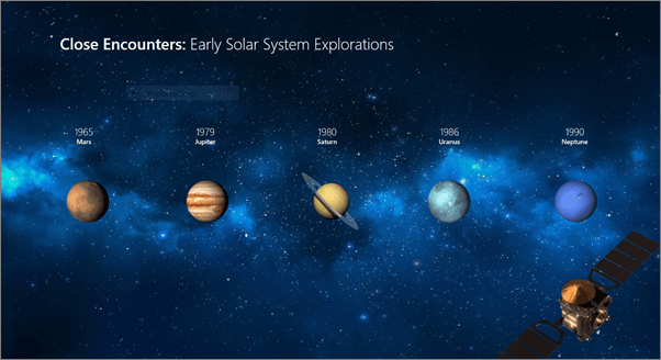
Here's an example via Microsoft of the morph feature seamlessly animating objects across slides.
This is the original slide:

And this is the morphed slide:

For more information on this feature, check out this article on Microsoft.
3. Designer
Note: This feature is only available to Microsoft 365 subscribers and PowerPoint 2019 users.
Don’t fancy yourself much of a graphic designer? Don’t worry—PowerPoint’s Designer tool can help you generate professional looking slides without much effort.
“Simply put, Designer automatically generates a sample design concept for your slide as soon as you insert content (such as a photo) into it,” Goetting says.
In addition to suggesting designs that will immediately update the look and feel of your presentation, Designer also automatically adjusts to match the color scheme and specific styling of the template that you’re using—saving you even more time and effort.

How to use Designer
Insert a piece of visual content—whether that’s a photo or something else—into the slide you’re working with.
When doing so, the “Design Ideas” window will appear on the right and provide plenty of inspiration.

You can also access the Designer tool at any time by clicking on the “Design” ribbon tab and choosing the “Design Ideas” category.
For more information on this feature, check out this page on Microsoft.
4. Slide hyperlinking
“Slide hyperlinking is a very useful feature few people know about or utilize,” says Goetting.
Using this tool, you can create links directly to other slides within your presentation—allowing you to easily hop around between desired slides.
“With this feature, users can create pivot points that allow them to jump to different slides in their presentation, ideally based on audience feedback,” Goetting explains, “The result is an interactive, evolving presentation experience that flows much more like an app or website than a traditional linear presentation.”
How to use slide hyperlinking

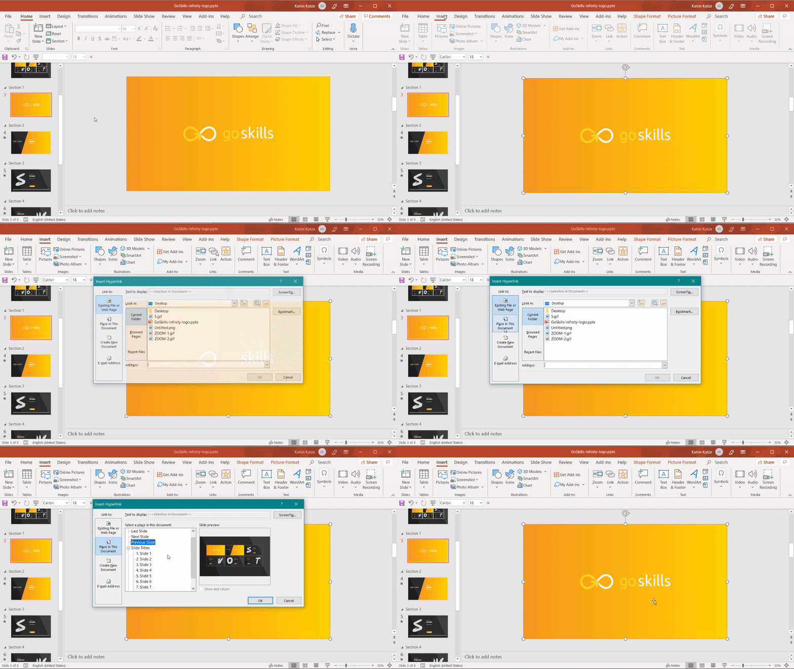
Within the “Insert Hyperlink” option, you can choose “Place in This Document” instead of the traditional place that you insert hyperlinks.
PowerPoint is what you make of it
These sorts of tools and features can help to kick up the visual appeal of your presentation. But, no amount of technology will save you if you don’t approach your slides in the correct way.
Goetting recommends choosing a fresher font (Font Squirrel is a great resource!) and using images or iconography (check out The Noun Project!) to supplement or replace text.
“Even simple visuals communicate much better than words,” he says.
And, of course, make your best effort to minimize text usage.
We’ve all heard this advice, yet business presentations continue to be plagued by paragraphs of corporate mumbo jumbo. Instead, focus on sharing keywords on slides, and use the presentation itself to explain the rest.
“PowerPoint is what you make of it. I find it amusing when people use other visual display tools, and you can see their creativity emerging, yet when they get into PowerPoint, they fall back into those bad habits. Ignore the default layout choices, start with a fresh slate, and imagine the best way you’d be able to understand your information if you were in the audience," he concludes.
Loved this? Then you'll love our printable PDF cheat sheet of the most important Microsoft PowerPoint Shortcuts.
Ready to master Microsoft Office?
Start learning for free with GoSkills courses
Start free trial


